Perhaps in a few years’ time, immersive technologies will turn current chart types into the silent movies of data visualization. While we wait for the future to arrive, it’s worth thinking of ways to add more data and extend the lifespan of the chart types we have today. If you think about it, many of the ideas discussed in the book will have that side effect.
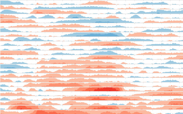
One way of adding more detail to a chart is by creating profiles. Profiling is the representation of entities by creating an array of similar charts in which there are two readings: a reading of each individual profile and a comparison reading with other profiles. The integration and interdependence of these charts should lead us to consider them as a whole—as a single chart rather than as separate charts.
Corrections & Suggestions
None so far.
Files
- (XLSM) Workbook for Chapter 13
Additional Resources
- National Snow & Ice Data Center: Interactive Sea Ice Graph.
- Birtifier: Revisiting Bertin’s Matrices.
Corrections? Suggestions? Leave a replay below.