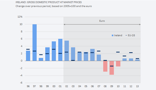
 This chapter is mostly about comparing data points. Some of the tasksyou can do when comparing data points are ordering, sorting, and ranking. Comparisons are found everywhere in data visualization, so much so that Edward Tufte says that “compared with what?” is “the deep, fundamental question in statistical analysis.” In a more or less explicit way, you’ll find comparisons at the heart of every category in our chart classification. If you aren’t comparing data points, you’re comparing trends or profiles.
Corrections & Suggestions
None so far.
Files
(XLSM) Workbook for Chapter 8.
(XLSM) Workbook for Population Pyramids.
Additional Resources
- Amanda Cox of the New York Times and the bar charts of a world without joy. If you suspect that Stephen Few wasn’t amused, you are right.
- Andy Cotgreave and the lollipop chart (one and two).
- (PDF) Stephen Few’s bullet chart design specifications.
Corrections? Suggestions? Leave a replay below.