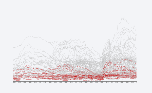
 The point is, effectiveness in data visualization is task-dependent and design dependent (not to mention data-dependent). You have to create a visualization that addresses the issue, and you must design it in a way that generates a meaningful communication for your select audience. Some people will tell you that “insights” is the metric you should use to evaluate its effectiveness. Others will insist that “engagement” is the right metric, and you achieve that by prettifying your visualizations. This leads to aesthetics. The role and importance of aesthetics define one of the major lines separating data visualization practitioners.
Corrections & Suggestions
None so far.
Files
- (XLSM) Workbook for Chapter 14
Additional Resources
- Giorgia Lupi: Beautiful Reasons: Engaging Aesthetics for Data Narratives
- Stephen Few: Information Visualization, Design, and the Arts: Collision or Collaboration?
- Robert Kosara: 3D Bar Charts Considered Not That Harmful (quick notes: Robert constantly reminds of how nuanced data visualization rules are, and that’s important; I know how to make a 3D bar chart that is better than a 3D bar chart if I cheat, but all things being equal I don’t know how 3D can be better than 2D; I don’t think data labels should be used to evaluate a chart).
- Lena Groeger: How Typography Can Save Your Life

Corrections? Suggestions? Leave a replay below.