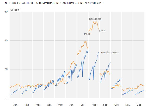
Since at least the time of ancient Greek philosophers, the river has been the preferred metaphor for describing the flow of time. It’s natural, therefore, that a metaphorical river, a line, is the primary representation of time in data visualization. We do use other charts to represent time, and we do use line charts to display non-temporal data, but the combination of time series and the line chart is especially useful. It respects the direction of time (from left to right) and focuses on the flow (rather than on individual data points) that will be read as meaningful trends and patterns.
The line chart is one of the best and most flexible types of charts for displaying change over time. It isn’t perfect, though. Some nuances may escape it, and at times it may also suggest nonexistent relationships, so we’ll discuss alternative formats as well.
Corrections & Suggestions
- Figures 11.9 and 11.10 incorrectly labeled the series for residents and non-residents. Please read the text in section “Seasonality: The Cycle Plot” taking this into account.
Files
- (XLSM) Workbook for Chapter 11.
Additional Resources
None so far.

Corrections? Suggestions? Leave a replay below.