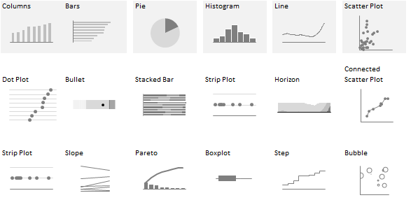
Even if we consider every single chart within the Excel chart library as a unique chart type (which we shouldn’t), that only scratches the surface of the myriad chart types available today. If you’re forced to choose from a vast number of options without a clue as to how to group or filter them, this leads to paralysis.
Classifying charts into categories is only a rough starting point, though, because even subtle design options can make a chart jump from one category to another. For example, when you add a variation band to a line chart, it probably means that you’re less interested in a trend than in spotting outliers, effectively moving the line chart to a different category. There’s no unambiguous relationship between charts and tasks, and more generally, a particular chart type does not have a direct relationship with any single task.
Corrections & Suggestions
None so far.
Files
- (XLS) Workbook for Chapter 7.
Additional Resources
- Andrew Abela proposed a classification severely criticized by Stephen Few. Some of Few’s remarks are specific to this classification and I tend to agree with them, and some are more generic (Few doesn’t agree that a one-page guide is helpful at all).
- Juice Analytics made an interactive version of Abela’s classification, Chart Chooser.
- Jonathan Schwabish’s The Graphic Continuum.
- Books:Richard Harris – Information Graphics: A Comprehensive Illustrated Reference (Amazon link)
- Matthew Ericson said, back in 2007(!) that the New York Times avoided scatter plots because readers simply can’t make sense of them.
- (PDF) Using the Beveridge curve. This is the source for the chart presented in page 171.
- Tableau Public example: Ramon Martinez is one of my preferred authors.
Videos
In this section of “Reveal”, her Tapestry 2015 Keynote, Hannah Fairfield discusses designing visualizations for small screens. Make sure you watch the entire presentation.
Corrections? Suggestions? Leave a replay below.