As all parents know, no two slices of cake are exactly the same. In the eyes of children, their piece is always smaller than the others’ pieces, which triggers the inevitable cry of “It’s not fair!” Evaluating the actual size of the slice is one of our first failed experiments in our assessment of proportions, something that will never change. Just like our irresistible fascination with all things circular. That’s why a chapter on pies and donuts is mainly an exercise in damage control.
Corrections & Suggestions
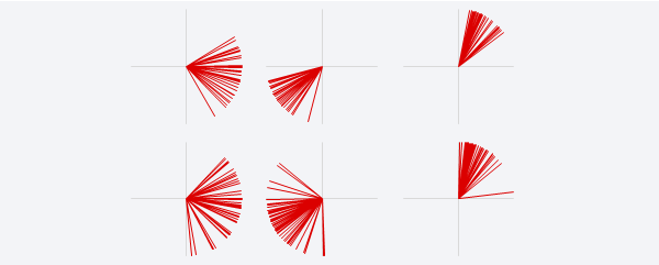
- Figure 9.17: The scale along the quantitative axis doesn’t make sense above 50. The scale is between 0 and 50, and then (implicitly) repeats for each panel. The custom number format is correctly applied in the workbook below. A white background was also added to the legend.
Files
- (XLSM) Workbook for Chapter 9.
Additional Resources
- (PDF) Stephen Few: Our Irresistible Fascination with All Things Circular.
- (PDF) Stephen Few: Save the Pies for Dessert.
- The chart in page 217 comes from an European Comission report, Investment for jobs and growth (PDF), page 70.
- I don’t think this adds much, but still: The Correct Way To Draw A Pareto Chart.
Corrections? Suggestions? Leave a replay below.